Showing posts with label tutorial. Show all posts

Tuesday, March 22, 2011

Batch Processing Clean up Drawings in Photoshop


I've been bouncing all over the place in terms of production, even with frame processing. I'll share how I do and if any has any suggestions to improve the process, then let me know!

I start by making a duplicate folder of all my scanned frames on the desktop. I also set up a folder that all my finished frame will go to once they are batched.


Before bringing them into photoshop, I label each frame. If you number them, make sure to start off with zeros. This helps keep them in order later. (i.e. 06, or heaven forbid that you have over a 3 digit quantity of drawings then 006)


Open one frame in photoshop, not all of them.


Okay, this next step will not affect the outcome of the batch, but it may affect the outcome of your sanity. Whenever you save something in photoshop, the program asks you to run a compatibility check. Most of us just dismiss this and forget about it. But imagine doing that OVER AND OVER AND OVER until all the frames are done. Yeah, it kills you a little. So we're going to do something to prevent it. Open up your preferences and go to File Handling.


There is a drop down menu next to the dreaded Compatibility checker. Change the setting to NEVER! If you're on a public computer then maybe it is best that you turn this back on to 'Ask' when you're all done just for courtesy's sake.


Now it's time to open up the Action box. (Hmm... action box, that sounds like a good name for a sports show. I'll have to write that down.)


This box should open up. We start off with a new set. Click the little button that looks like a folder.


I like to name the set after the shot title just for keeping things organized.


Now we need our first action in the set. Click on the button with the folded piece of paper.


You should only need to do this once, because once you hit that 'Record' button, then everything you do, where you do it, and how you do it will be recorded. You can always turn record on or off through the process if you need to stop.


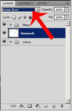
Okay, we're recording now. My first action is to unlock the image layer. You can do this easily by going to the Layer box, double clicking on the locked layer, and then hit 'Okay'. Done.


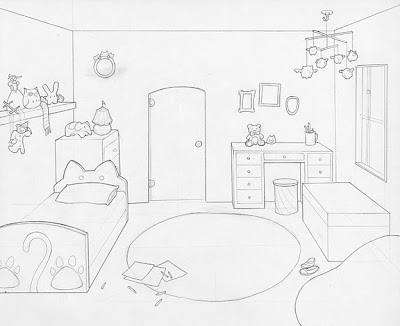
I like to crop down some of my animations, especially the ones that are small and have little movement. This might not be a good idea for ALL your animations so judge wisely. Make sure that your cropping will encompass the entire path of action for your animation because those same dimensions will be repeated with every frame.


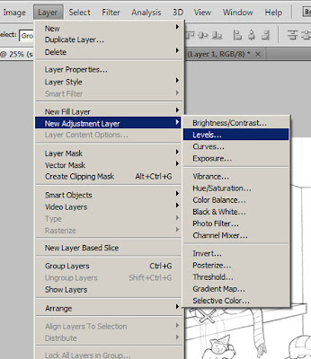
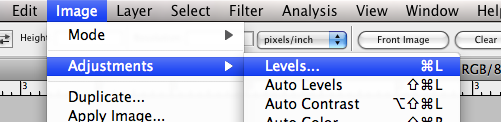
Once I do that, I toggle with the levels. Levels adjusts what is true dark and what is true light. This makes selecting the whites of the frame easier. Go to the Image menu and under Adjustments you should find the Levels. (Or apple L for short)


Adjust the little tabs around until the background is a little more pure white and the lines are darker. This might affect the line quality a bit.


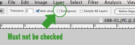
Now we are going to select the white area. Using the magic wand tool, select an area in the frame that is white. REMEMBER, the point you click on will be recorded and photoshop will select that point for every single frame If there is a line present there in another frame then the lines will be selected and not the negative space. A corner is usually a good choice. Make sure the Contiguous box is not checked.


Select the white area and delete it. Only the black lines should remain. Easy enough, right? If you want to test out the lines, stop recording (the blue square button in the Action box) and use the paint bucket tool to fill in a test area. If there is still white edges, then more more refining is needed. Undo the paint and start recording again (the red circle button).


Under the select menu is the Color Range function.


This will help us target those tricky little white edges. Select 'Highlights' in the drop box. This will find those stray light lines. Hit 'Okay'. This will select the light pixels and you can simply delete them.


This is what the finished lines look like. If you want to, stop recording again and do another paint bucket test. But turn it back on when you're done because there is one last important thing to record. Save this file as a PSD in the batch folder you set up earlier. If you don't record this, then all of your files will just close themselves when they are done being processed and they won't be saved. Once you have saved, stop recording.


Under the File menu, go to Automate and select 'Batch'.


For the Play section, make sure that the Set and Action we started earlier are selected. In the source section, set the source to Folder and choose the folder of duplicate frames we made earlier, not the originals. In the Destination section, set it to Folder and choose the Batch folder you made. Check the "Override Save As Commands" box or else you'll be bombarded by the saving options box after each frame and you'll go crazy. Lastly, and this is really important, name the files. I like to name them after the shot title and then use 'Lines' as the extension so i can know what they are. But most importantly, Use a 2 (or 3) digit serial number. Photoshop's Automate function will name and number each file automatically.


Once you hit the 'Okay' button, your batching will begin. All the finished frames should end up in the batch folder. Make sure to review them when it's done. Batching is one of those things where the planets have to align in our for it to turn out right. One tiny little misstep could ruin the entire batch. And not all shots will turn out identically so there is a lot of judgement involved. I would suggest doing a few practice runs before actually doing it for real. It's a subtle art that isn't easy to get right away. If anyone can think of any ways to improve this process, make sure to tell me so that I can improve this tutorial.

Friday, February 25, 2011

Experimenting with Compositing Modes = Awesome!


So while tweaking my work reel I thought I'd find a way to make the colored animation tests of the acrobats doing their stuff blend in a little more seamlessly. Normally you would drop all the PNGs into After Effects and sequence them into a video there but I did it in iStopmotion as a test and planned to do it in AE later. Lo and behold something strangely cool resulted on this. Even though this images were PNG files (which preserves the transparency) and had no background, iStopmotion hasn't figured this out yet and just fills the empty space with black. This wouldn't be the case with After Effects. I put the test into the work reel for a temporary placeholder and I tried playing around with the compositing modes so you can at least see the watercolor background beneath it. I was surprised by the results.
This is what the original test looks like. Note the black background.


The watercolor painting is brought into Final Cut and placed beneath the video clip.


Right clicking on the video clip and then selecting Difference in the Composite drop down menu.


See the difference! (^_^ lol, no pun intended)


It looks really interesting now because the inverted texture of the watercolor in the background can be seen in the acrobat. So spooky! But now the colors need a little adjusting. In the Effects menu, scroll down to Video Filters followed by Color Correction and selected the Color Corrector filter.


Using this tool I can change the color and value a bit to make the acrobat a little easier to see. I'm just going to adjust the value and saturation controls.


Here are the comparisons between the different stages.


And here is the final product.


Tuesday, January 4, 2011

Inside the Dark Circus: Watercolor Background Process

Tutorial time!


As I mentioned a few posts ago my very helpful background assistant, Homin Jang, painted up a collection of custom watercolor textures for me to use the backgrounds for inside the circus tent. I went with the idea of a simple textured background because I didn't want to draw too much attention away from the acrobats' performance with any overly detailed and heavily saturated backgrounds. These watercolor backgrounds are just interesting enough to lightly compliment the animation of the the acrobats without being too distracting. Another plus is that I can make them really fast and easily so they're a great time saver. Let's get started!

This is the watercolor painting I start off with.


I bring it into Photoshop but I decide not to mess with levels or saturation. The colors and textures are just fine the way they are.


For these backgrounds, I'll be using my all time favorite tool, the gradient tool. I LOVE using gradients to shade and render images so it's what I'll be using to add values and colors to our painting.


Make a new layer overtop the original painting and select the color black with your color picker. Make sure to have the color-to-transparency setting selected and also don't forget to play around with the opacity. Use both the linear and radial gradient tools for varying looks.


Now just drop in some random gradient values anywhere you fancy. Be careful not to go overboard and lose all those beautiful textures.


There we go. Now our painting has some ominous shadows. But keep in mind, it is better than these backgrounds are too light rather than too dark, and it's always better to assume that more screens will show things darker than your work screen.


Next it's time to drop some more colors into our backgrounds. To keep with the slightly creepy theme, I'm going to add some more dark reds, pinks, and purples. Feel free to turn off your black layer for this.


Make another layer below the one you just did. Repeat the same process as with the shadow layer by dabbing in some globby gradients of color. Just don't overdo it.


Now for the final adjustments. Since we want to make the black layer a shadow value layer, set the mode to Multiply. This means that the darker the color, the more opaque it is sinks into the image while lighter values become more transparent. That way, is it's too dark, you can lighten it up a little with some gray gradients. You can also toggle the opacity to achieve the desired darkness for this layer. The color layer we just did needs to stay below the value layer and keep it set to Normal. And don't forget to label your layers! Organization is key!!


And there you have it! The original painting has been Dark Circus-ified. This process is easy to repeat so a lot of these can be done in a jiffy.


Wednesday, November 3, 2010

The Background Coloring Process

I've spent a lot of time focusing on the backgrounds lately. I guess I want to get a good chunk of them done before winter break. One thing that I have to think about when I'm coloring these backgrounds of the bedroom is that some of these drawings are seen more than once in the film and at different times of the day. This bedroom shot for example is seen at sunrise and at night.
In this post, I'll give a little insight onto my process for coloring these backgrounds.

Morning Lighting
Night Lighting

First I scan my layout drawing into photoshop at 300 dpi. Because I am atrociously slow and doing linework in photoshop, I like to do all my clean line drawing right there on the layout.


In order to refine the lines a little more, adjust the levels settings. This controls what photoshop determines is true white and what is true dark. This helps eliminate some ghosts of erased lines and any paper textures that seeped in through the scan.

Now that the drawing is all pretty and clean. It's ready for coloring. But first.....


Before I touch my drawing with any color, I need to set the layer compositing mode. I'm using Linear Burn for this drawing because I need the lines to be able to show through the flat color. Compositing modes such as Linear Burn, Color Burn, and Multiply drop the lights from an image (in this case, the white parts of the drawing) and leaves the dark lines in full view. This way, I just create new layers to color on underneath the line drawing layer.


Flat color the drawing. To me, this is actually the most time consuming part of the coloring process just because I'm always messing around with my color choices.


Gradient time! I love drawing with gradients. With the exception of a few touches here and there with the bruch tool, this whole room was rendered with different gradients. Sometimes that means selecting an object, creating a new layer, applying a few gradients to that selection, and changing the compositing mode of the gradient layer just for the shadows alone. There are also gradients for highlights, reflected lights, and cast shadows.
If I were to set all the compositing modes on the layers back to normal, this is what the background would look like. The reason that I shade with value tones like grays and blacks instead of colors is because if I change my mind about a certain color, I can just change the flat color layer and leave the shading layers alone.
Now that all the colors and values are in place, it's ready to see a little sunshine. This shot is first views in the beginning of the film during sunrise, so it needs a pinky-orange cast to it. By laying a peach colored gradient leading away from the window and setting the compositing mode to Overlay, I get a warm morning glow. A few orange sunbeams are dropped in too.
It's a similar process for the nighttime shot. But instead of just a gradient on half the screen, it's a full fill color dropped right over the whole drawing and then setting the compositing mode to Hard Light.


Once the character animations are added in with After Effects, I'll also made a few more lighting changes to the backgrounds. I'll be applying this process to several more backgrounds in the upcoming weeks so I better get my coffeemaker up and running!