Tutorial time!

As I mentioned a few posts ago my very helpful background assistant, Homin Jang, painted up a collection of custom watercolor textures for me to use the backgrounds for inside the circus tent. I went with the idea of a simple textured background because I didn't want to draw too much attention away from the acrobats' performance with any overly detailed and heavily saturated backgrounds. These watercolor backgrounds are just interesting enough to lightly compliment the animation of the the acrobats without being too distracting. Another plus is that I can make them really fast and easily so they're a great time saver. Let's get started!
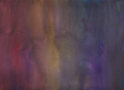
This is the watercolor painting I start off with.

I bring it into Photoshop but I decide not to mess with levels or saturation. The colors and textures are just fine the way they are.
For these backgrounds, I'll be using my all time favorite tool, the gradient tool. I LOVE using gradients to shade and render images so it's what I'll be using to add values and colors to our painting.
Make a new layer overtop the original painting and select the color black with your color picker. Make sure to have the color-to-transparency setting selected and also don't forget to play around with the opacity. Use both the linear and radial gradient tools for varying looks.
Now just drop in some random gradient values anywhere you fancy. Be careful not to go overboard and lose all those beautiful textures.
There we go. Now our painting has some ominous shadows. But keep in mind, it is better than these backgrounds are too light rather than too dark, and it's always better to assume that more screens will show things darker than your work screen.
Next it's time to drop some more colors into our backgrounds. To keep with the slightly creepy theme, I'm going to add some more dark reds, pinks, and purples. Feel free to turn off your black layer for this.
Make another layer below the one you just did. Repeat the same process as with the shadow layer by dabbing in some globby gradients of color. Just don't overdo it.
Now for the final adjustments. Since we want to make the black layer a shadow value layer, set the mode to Multiply. This means that the darker the color, the more opaque it is sinks into the image while lighter values become more transparent. That way, is it's too dark, you can lighten it up a little with some gray gradients. You can also toggle the opacity to achieve the desired darkness for this layer. The color layer we just did needs to stay below the value layer and keep it set to Normal. And don't forget to label your layers! Organization is key!!
And there you have it! The original painting has been Dark Circus-ified. This process is easy to repeat so a lot of these can be done in a jiffy.


