
In this post, I'll give a little insight onto my process for coloring these backgrounds.
Morning Lighting
.jpg) Night Lighting
Night Lighting.jpg)
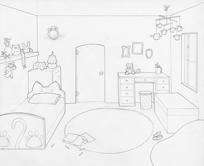
First I scan my layout drawing into photoshop at 300 dpi. Because I am atrociously slow and doing linework in photoshop, I like to do all my clean line drawing right there on the layout.
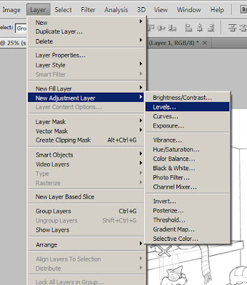
In order to refine the lines a little more, adjust the levels settings. This controls what photoshop determines is true white and what is true dark. This helps eliminate some ghosts of erased lines and any paper textures that seeped in through the scan.
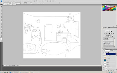
Now that the drawing is all pretty and clean. It's ready for coloring. But first.....
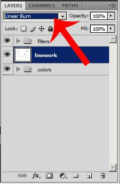
Before I touch my drawing with any color, I need to set the layer compositing mode. I'm using Linear Burn for this drawing because I need the lines to be able to show through the flat color. Compositing modes such as Linear Burn, Color Burn, and Multiply drop the lights from an image (in this case, the white parts of the drawing) and leaves the dark lines in full view. This way, I just create new layers to color on underneath the line drawing layer.
Flat color the drawing. To me, this is actually the most time consuming part of the coloring process just because I'm always messing around with my color choices.
Gradient time! I love drawing with gradients. With the exception of a few touches here and there with the bruch tool, this whole room was rendered with different gradients. Sometimes that means selecting an object, creating a new layer, applying a few gradients to that selection, and changing the compositing mode of the gradient layer just for the shadows alone. There are also gradients for highlights, reflected lights, and cast shadows.
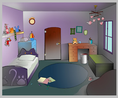
If I were to set all the compositing modes on the layers back to normal, this is what the background would look like. The reason that I shade with value tones like grays and blacks instead of colors is because if I change my mind about a certain color, I can just change the flat color layer and leave the shading layers alone.
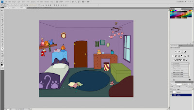
Now that all the colors and values are in place, it's ready to see a little sunshine. This shot is first views in the beginning of the film during sunrise, so it needs a pinky-orange cast to it. By laying a peach colored gradient leading away from the window and setting the compositing mode to Overlay, I get a warm morning glow. A few orange sunbeams are dropped in too.

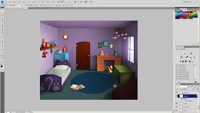
It's a similar process for the nighttime shot. But instead of just a gradient on half the screen, it's a full fill color dropped right over the whole drawing and then setting the compositing mode to Hard Light.

Once the character animations are added in with After Effects, I'll also made a few more lighting changes to the backgrounds. I'll be applying this process to several more backgrounds in the upcoming weeks so I better get my coffeemaker up and running!
6 comments:
this is awesome! ^_^ I didn't know about these photoshop tricks
Great description of the process. The end results look fantastic.
I came here looking for coloring inspiration. I left satisfied (that's what she said).
Really beautiful work Erin. I like the process you have for coloring, it's simple and the end result looks brilliant. I can't wait to see this when you put some animation in there it's really going to come to life.
-Kevo
Thanks everyone! :)
Excellent post.
Post a Comment